SafeSide Prevention provides video-based suicide prevention education and a community to help organizations provide additional training for their staff. Their online programs are tailor-made for Behavioral Health, Primary Care, and Youth Services. Their core user groups are hospitals and smaller health care providers who want to unite their staff and train them on this incredibly important subject.

Hospital unit or department managers with busy schedules are in charge of 5 to 50 doctors, nurses, and other medical professionals at any given time. These managers are being tasked with training their staff on suicide prevention using the SafeSide Prevention guided workshops. But with a lack of information and clear path to success, managers grew impatient and gave up from the very beginning. Because of this the SafeSide workshops weren't being utilized and important information wasn't being taught on this incredibly important subject.
As the lead designer on this project, I led a single engineer and worked closely with key stakeholders from start to finish. My initiatives included information architecture, user flows, visual design, product thinking, and prototyping. My other initiatives were to keep the project on track both from a timeline and budget perspective.
We were able to identify problems by talking with stakeholders to understand the audience, their goals, and desired outcomes but lacked what the users problems were. We were able to dive deeper using remote usability screen recordings from Hotjar. From this research we were able to craft user flows, basic personas, and a feature list with three major phases.
We also talked with the Customer Service team and noticed themes of user complains. These themes were missing important content, no clear direction of starting and ending points, and a general feeling of online vertigo. This information helped guide our objectives along side our previous findings with Hotjar.
Based on our initial discoveries we wanted to focus on the following for the first phase of this project.
Simplify the Account Creation/Login: We discovered a large amount of users dropping off trying to create accounts. Frustrated users here leads to a drop in training completion.
Wanted to introduce new users to SafeSide softly: This is their first real interaction with the product so first impressions are important and didn't want to overwhelm new users.
Make programs more apparent and easier to follow: Meaning place important information where it needs to be and give clear indicators of where to start and finish.
Future Planning & Features: As SafeSide continues to grow and develop, the application needed to be flexible to allow for future features to enhance the overall user experience.

Updated Account Registration User Flow
As I finishing up the discovery portion, I started to build out the Design System based on their existing brand. This was a complete rework of the UI kit with the goal of a clean, modern, and flexible system moving forward.

Updated Style Guide & Component Library
My goal was to create a simple way for users to interact with the SafeSide Account Dashboard and train their staff. I started rapid iterations of the core user flows in order to gather and implement feedback. I was able to refine the design system and keep our other objectives in mind.
Below is the process of how I Simplified the Account Creation and Login Process. The idea is to keep the user focused only on what they need to do at that moment. Before we had lots of distractions(navigation, text, buttons) that took our users attention from their goals, which was to access training material. By having a single input that allowed even the busiest manager an easy task to accomplish. This also eliminated the need for a separate login and account creation pages.
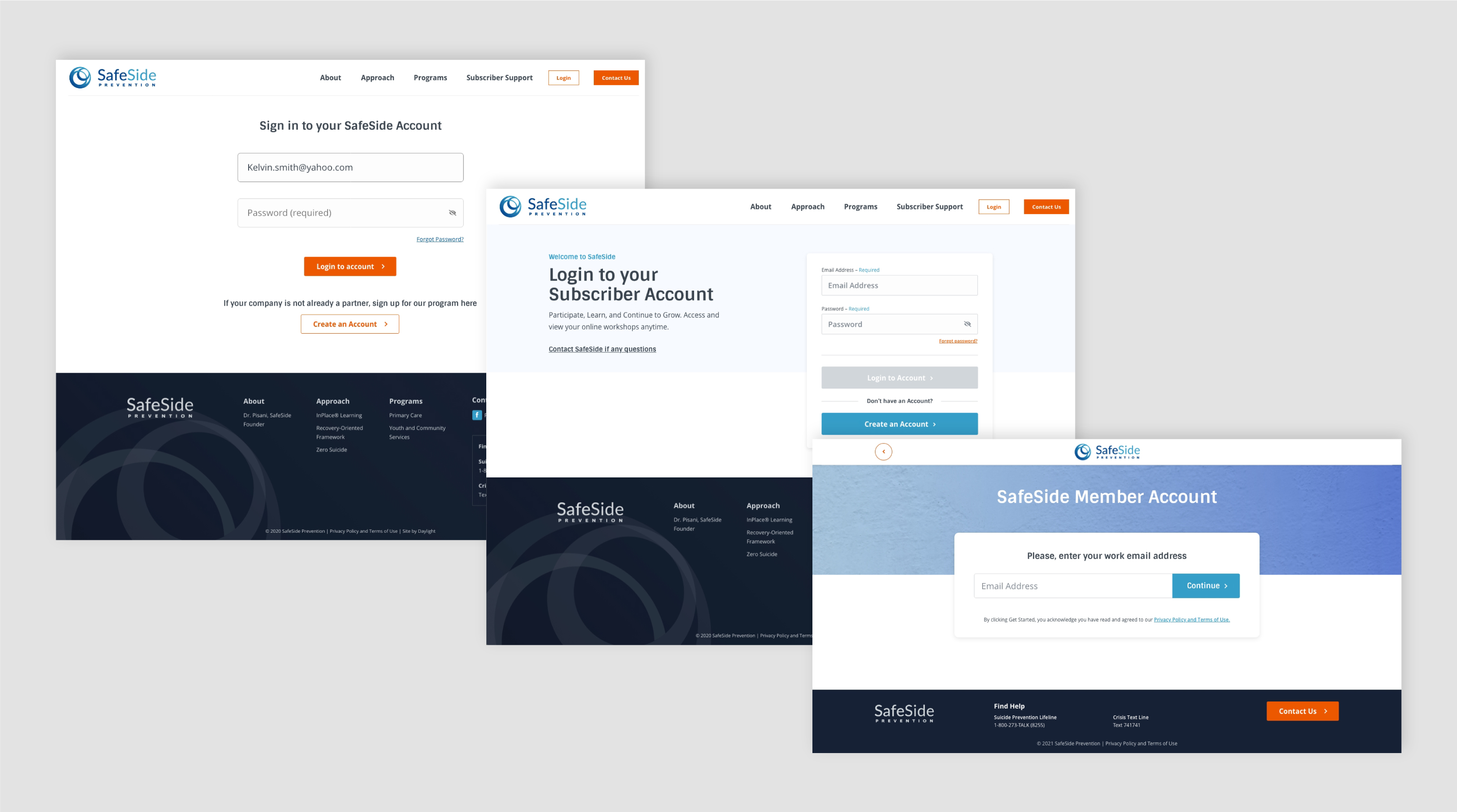
Iterations of the Login page

Final iteration of the login screen
All first time SafeSide users who created a new account would be introduced to SafeSide softly with helpful tooltips and guided tour. This encouraged discoverability on their own time while giving them a birds eye view of where to start.
I made programs more apparent and easier to follow by making the layout more linear so a user can expand each module without losing where they were within the application. The navigation was reworked based on an updated Information Architecture. Videos and can't miss downloads were grouped together so no more important information was being missed. All while building out the Design System to be as flexible for future updates.

Updated SafeSide Account Dashboard
Collapsed Programs

Grouped PDF Download with the video it was supposed to be with
Prototype of program expansion and modules
There are lots of exciting updates and features being planned now that SafeSide has this incredibly flexible application. Every decision that I made had future planning & features in mind. Below is a high level of how this application will continue to grow.

Future Features Currently Planned
The account creation process leveraged existing survey data so busy users can sign up with fewer issues. The app has a lightweight UI that is intuitive and easy to use. User onboarding has reduced users frustrations and encourages discoverability so training can be done effectively and effortlessly. A new Information Architecture and Navigation allows for easy scalability of future features and updates. The updated SafeSide Account Creation and Application has been very positive. Stakeholders, existing clients, and new contracts are excited about the intuitive direction which relies on less human interactions so SafeSide can focus on exciting new features and goals.


