Sweet Harmony allows anyone to book a classical musical ensemble for their special event. Over the past 15 years they have been growing but their booking system was extremely outdated and had the technical equivalent of duct tape holding it all together. I was tasked with a complete redesign of their product and marketing website.
After many interviews, discovery sessions, and meetings I was able to define a problem statement to keep our team focused. The main problem was, customers had to navigate too many obstacles to book, manage, and edit their events which lead to users looking for alternative options.
I was the lead the Designer and relied on a collaborative approach, I involved my lead engineer from the very start. I wanted to make sure everything I produced was within reason and also to ensure the application was still meeting the business and market needs. By bringing in the lead engineer from the first iteration we were able to create a great partnership during this difficult project.
After defining the problem statement I mapped out the core pieces on how to break down this large project. Below are our core deliverables and phases of this project.
New Booking Process: By focusing on thorough booking process we could provide a positive experience letting users build their event, get real time pricing, and book musicians in minutes. No more waiting for a person to get back to you.
Updated Booking Dashboard: This would allow customers with booked events to edit, manage, and update their events in one place. Give customers a sense of ownership and confidence knowing they are in control of their event.
Custom Music Program Selection: Sweet Harmony has almost a thousand songs that can be played at any event. I needed to create an simple way for customers to build their own music plan for each of their booked events.
Much Needed Marketing Site Update: Their existing site needed a hard refresh, the challenge was could I pair the UI from the application to their site while still being fresh and approachable? And there had to be flowers, lots of flowers.

Original booking process for all users
First, I brought back the lead engineer to discuss the possibilities and limitations of updating a complex booking flow. We were able to collaborate on the best direction and stay in contact when any problems came up. These conversations led to positive decisions being made which helped the final solution.
I started by getting the structure of the booking process in place. This helped discover potential dead ends and cliffs users could face. It also helped align myself, the engineer, and the client on how we would create the best experience. Next, I started to list out visual elements such as forms, buttons, date selectors, and other reusable components that I would need to start building out this process.

A glimpse at the complexity of updating their ensemble selection
Some of the early explorations focused on grouping similar questions in order the help build the user's event. As we tested and gathered feedback I discovered potential users felt overwhelmed with the number of questions. Further refinement led to less of an overwhelming feeling but I wanted to push the experience even more. Below are several rounds of refinement as I progressed through this phase of the project. I was able to iterate quickly here by taking what worked well and moving forward with those ideas.

Several rounds of iterations helping to refine the final solution
After many rounds of iterations, I landed on a single question at a time. Think Turbo Tax but instead of complex tax regulations, you're booking a classical musician for your special event. This created an ideal balance of conversation and information gathering. This approach allowed users to quickly build their event without too many technical hurdles to jump over. By focusing on a single question users wouldn't feel rushed to answer all questions on the screen.

Step through the booking process a single question at a time

Creating the perfect ensemble for your event

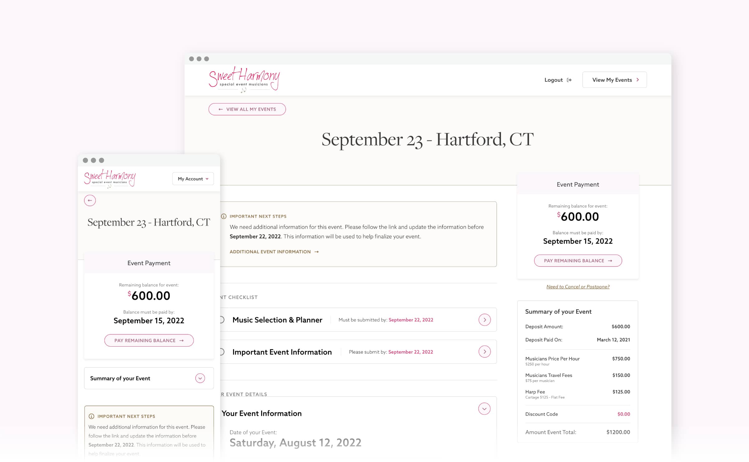
Booking confirmation screen where a user can review confirm, and edit their booking
As users needed to manage and update their bookings, I came up with an intuitive easy-to-use dashboard. Here, users can manage notifications, view upcoming events, and finalize all upcoming event details. I used a very lean design, focusing users' attention on notifications/updates on which events were fully paid and their music program selected.

Personalized dashboard to manage and update your events
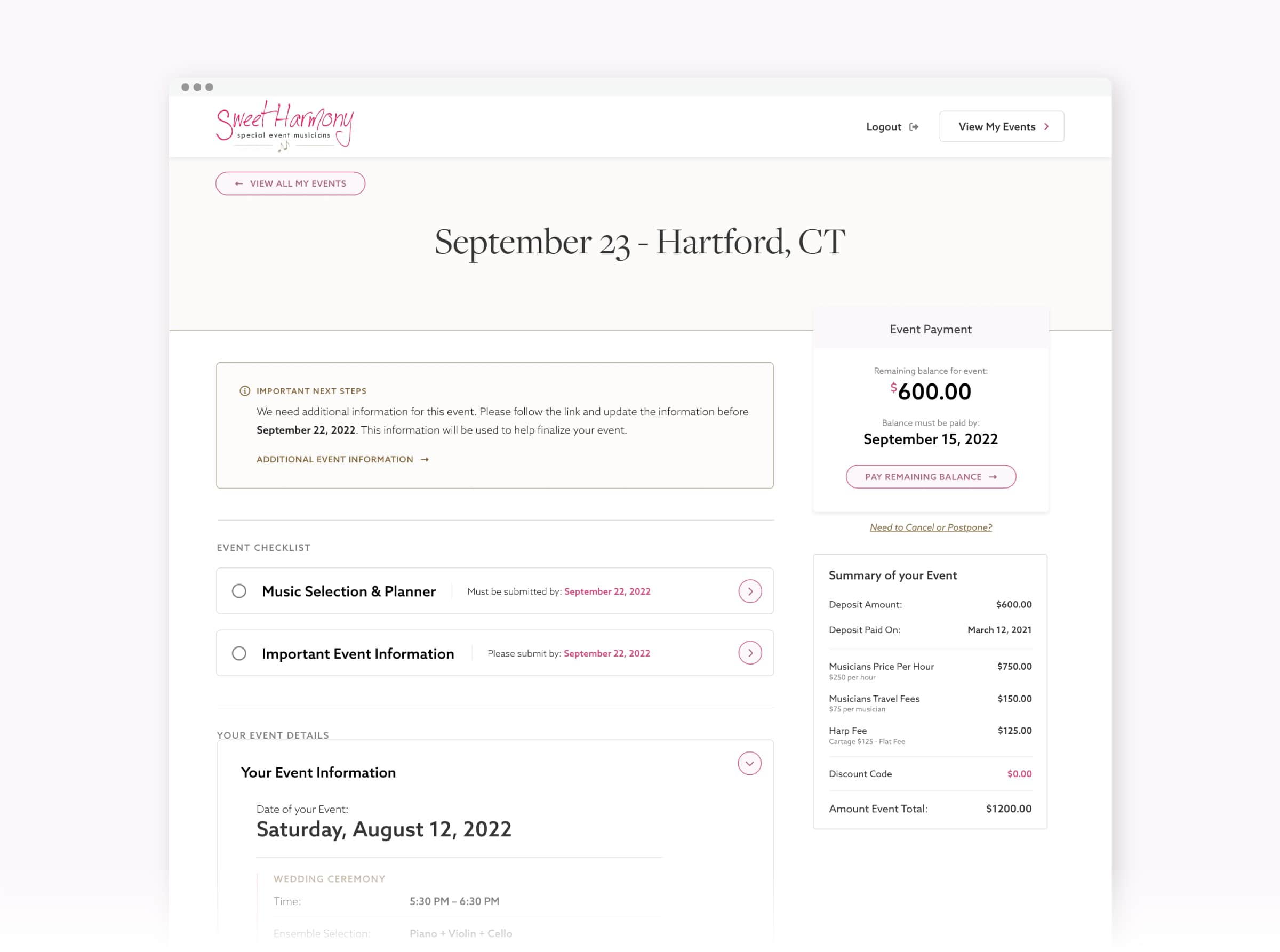
Booking detail with all important information and next steps
After booking, a user has two options for their song list. Sweet Harmony has preconfigured music programs based on your ensemble, this makes it super easy for users who just want the classics. The image below shows how easy it is for the user to select a preconfigured program. If users would like to go down this route their event would be complete.
The other option is to build your song list. The challenge would be to design an interface that allowed Sweet Harmony to capture information for certain parts of the event while letting users feel in control. Users had to ability to search a database with hundreds of songs and select to perfect one for each part of their event.

Allowing users select a preconfigured music program
Empty state for custom music program

Here is where users would add songs to their custom music program section by section

Completed section of a users custom music program

Event detail where everything is completed
Last but not least I had to ensure the UI of the Marketing site matched the application. This was their first impression of Sweet Harmony so it had to look nice. The challenge here was to keep the cleanliness but also make sure the site wasn't boring. I couldn't leave out the flowers so I was able to create vector elements that helped provide depth around images and other elements. I also introduced a seamless pattern that broke up a lot of the white space on these pages. The entire site is welcoming, educational, and easy to use. This paired with the update application made the ensure experience feel seamless and trustworthy.

Updated Home Page for their marketing site
This project was extremely challenging with so many technical details and constraints. I was fortunate enough to be able to lean on my engineer for a lot of those details. As a whole, this project was very rewarding and pushed me to think outside the box as a creative problem solver.
As I reflect on what I would improve, a few things stand out. I'll start by saying I love the conversations about the booking process and how easy it is to use. I do want to see a more detailed indicator of where the user is in the flow. It doesn't need to be over the top but something more helpful than the four links at the top. First-time users may feel like they've been lost but more seasoned users will know where they are. There are other areas I'd improve as well but as the saying goes, you never get it right the first time.


